First of all… what is Prop Styling? Well… I’ll tell ya…
in short… it is a term usually linked to commercial displays for magazine photo shoots, commercials, movies, etc.
Prop styling involves (along with other responsibilities) arranging items/props in a visually pleasing way that accents a product, a theme, a room, etc. Most people who do this for a living are called prop stylists.
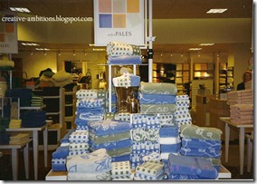
I use to work in retail visual display for many years… another avenue in prop styling.
From soft goods (clothing)… to hard goods (home décor)…
from department stores to retail website styling… yep I’ve created a few displays in my time.
It never really paid much in my small town, but I did enjoy the creativity of it all.
At times…
we had to build and paint our own props from scratch
and then other props and/or merchandise were either bought or supplied by the company.
So… how I display in my HOME… is what I learned from being a retail prop stylist or
visual display artist… as I use to call it.
This is Part One (breaking into 2 parts because of length)
of some tips I thought would be helpful while prop styling your mantel, armoire, table, above your kitchen cabinets…
or any vignette for that matter.
Today…
I’m discussing THREE tips I consider when creating displays…
Theme, Composition, Balance
THEME
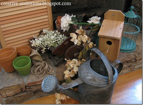
Many times, I try to think of a theme to help create my mantel displays or vignettes. I like to create a story with my displays. Of course, you can just go with a seasonal theme, but I like to get specific sometimes. It helps me to be deliberate with my ideas/props and not just have a random hodgepodge of things going on. For example, this summer mantel’s “story” is The Potting Shed. So naturally, I looked for things that you might find in and around a potting shed. Having a specific idea or theme can help in finding the right props to use to make the perfect visual statement and story you have in mind. As you will see in the photo below… I gathered all the summer potting shed props that I already had on hand and put them near my display area. So I just pull from the pile while I’m trying to figure out what to use.
COMPOSITION
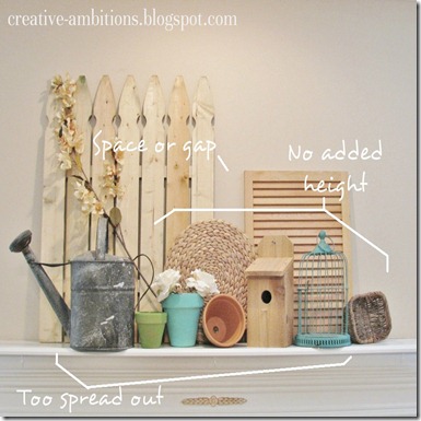
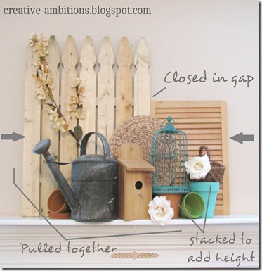
examples:
Before After
BALANCE
Balance is important and goes along with composition. You can go symmetrical or asymmetrical in your display… it’s up to you. But just remember… either way… you want balance. If you go asymmetrical, you don’t want your eye to get stuck on one side of your display. Nope…instead… your eye should FLOW across the piece… like a work of art (because that is what you are creating…right?) I’ll answer that with a YES! So… if you use an item that is much bigger (in size) on one side (say the left side) than the other… maybe use a strong color (on the right side) to bring the eye across your display. I call it “eye sweeping”. Just a little term I came up with… meaning to pass over the display with your eye in a continuous movement.
examples:
to be continued…
Let’s go over some highlights from today’s tips…
‘The Wrap Up’
1. If you have trouble coming up with an idea for your space… think of a theme and choose related items that would bring that theme out in your display.
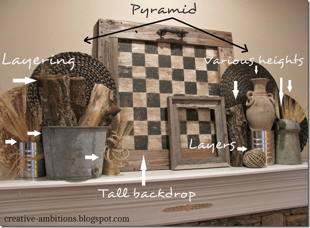
2. Think about the composition of your display… just keep in mind the spacing, height and balance of your display. Fill in those gaps of empty space by pulling things together and layering them in front of one another to add depth/dimension. Create height by stacking items on top of one another.
3. To create balance… whether symmetrical or asymmetrical… make sure your eye sweeps across your display. Being aware of sizing and color can help you create a nice balance in the arrangement of your props.
I do hope this has been helpful and inspiring to you.
But remember… these are just tips…
and hopefully they will help you in your home or business…
especially if you’re a shop owner or have a booth.
As far as your own personal home… when it’s all said and done… “beauty is in the eye of the beholder” and how you display your things/props in your home is subjective… what you like and enjoy is most important!
If this post has shed some light or given you some confidence
in creating your own home or business displays…
please let me know!
See you soon for Part Two… Click Here!
Thanks For Stopping By!






Hey Kendra! Great post with great tips! Makes sense that you were a visual merchandiser - your display talents are wonderful (that was a job I used to dream about doing when I was in school). LOVE your colorful potting shed mantel...
ReplyDeleteLooking forward to part two!
Hugs & Blessings,
Becky
Kendra!!!!!! I LOVE this! It's very interesting how closing that gap changed the entire feel of your display. You have beautiful style!
ReplyDeleteMiss ya!
XO
Thank you for posting this! I'm always struggling with ways to decorate the mantle! It seems like it's never quite right! I love the idea of thinking of a theme first. Not just a season!
ReplyDeleteHi Kathy... so glad you found something you can hopefully use when you're decorating your mantel!! Themes can definitely help narrow it down for you... rather than just a season. Thanks for stopping by!!
Delete