This is part two of my tips on prop styling in the home.
To read part one… CLICK HERE.
Whether you are creating a display for your mantel, armoire, table…
or any space…
I think these tips may help you style a beautiful and creative arrangement or space for your home or business.
In Part One, I discussed Theme, Composition, and Balance.
Now… let’s continue shall we?
Starting with my 4th tip…
HARMONY
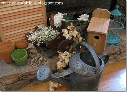
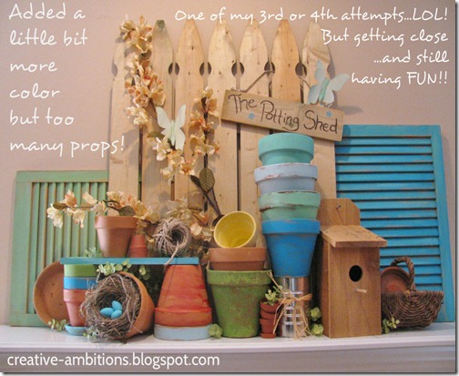
Determine how much is too much. Sometimes less is more and learning the balance here can be key! If there is too much “action” going on in your display… then it may just end up looking like clutter and confusion. You don’t want the props in your display fighting each other… you want harmony! I actually struggle with this determination at times. I will end up having so many interesting pieces that I want to use for my theme, it is hard for me to pick and choose. So… in order for it not to look too busy… too heavy… I really try to consider the amount of space I’m working with verses the amount of props I have to use. I usually end up leaving some of my pieces out if it just feels or looks like too much. The space in which you are working can help you determine how many props to use.
This is the best example I could come up with to give you an idea of what I mean…
NUMBERS
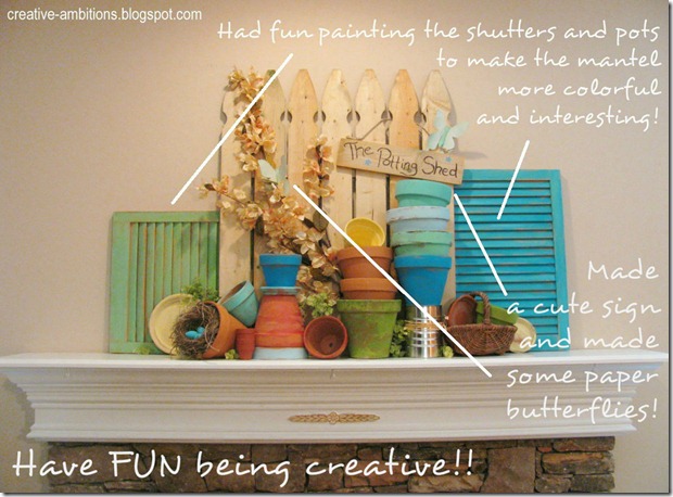
This is one that I don’t always stick to… although I do agree with it. It is a known “rule” that ODDS are better than EVENS especially when you are displaying a collection or series of something. For some reason (don’t know why)… odd number of things create more interest, more eye appeal and balance. Working in retail visual display for so long actually taught me to “see” in odds. Like my picket fence for instance…I used 7 boards instead of 6… 7 had more balance to me than 6. Also, on my summer mantel… I used 3 backdrop pieces instead of 4… it just looks more interesting and balanced to my eye that way. However… I have broken this rule depending on the size of a room or space and the look I’m going for… like my kitchen wall below. An even number of placemats on my wall felt and looked better to me than an odd number. So, I guess it just comes down to what is most appealing to your eye.
Using odd numbers on my mantel…
Here… an odd # looks better than an even # on my shutter wall…
But… on my faux painted wall… I felt that an even # placemats fit the space better than an odd #…
FUN
FUN… yes… having fun creating my story, my theme, my display is one the best parts of the creative process in prop styling. Since it’s in my own home…there’s lots of room for mistakes and do overs… lots of freedom. I don’t always like what I create, and yes… tearing down and putting back up can be frustrating… if your goal is to show the finished “look” to other people… like on your blog! :) SOOO… if you find yourself in this place… as I sometimes do… just take a break and come back to it… maybe later on or another day. I find when I try to force what’s in my head to “paper” so to speak… it can really get frustrating when it doesn’t work out in the space or prop you’re working with. Unfortunately, what’s in my head doesn’t always fit the space like I think it will. So… it’s best to just be flexible and make sure you have fun with it!
♫ OH… and play your tunes while you create!! ♫
Before:
Another Before:
Finally… After!!
This is my fun shot…LOL!
Time for the…
‘WRAP UP’
Highlights of today’s tips…
1. Really try to step back and be able to determine when you have too many things or not enough. Keep in mind that less is more and go from there. You are going for harmonious look or order… not clutter.2. Determine by the space you have if an odd number is more interesting that an even number of items. Displaying in odd amounts rather than pairs can create interest, visual appeal and even balance to your wall or display.
3. FUN! FUN! FUN! Have fun and enjoy the creative process of making a beautiful, interesting display for all to see!
I do hope this has been helpful and inspiring to you.
But remember… these are just tips…
and hopefully they will help you in your home or possible business…
especially if you’re a shop owner or have a booth.
As far as your own personal home… when it’s all said and done… “beauty is in the eye of the beholder” and how you display your things/props in your home is subjective… what you like and enjoy is most important!
As always…
Thanks For Stopping By!


great post! I will try your method! Please stop over and say hello@ http://mashabakescupcakes.blogspot.com/
ReplyDelete